- What is the most significant contribution this designer made to the field of typography?
The “Beat the Whites with the Red Wedge” poster is the most significant contribution Lissitzky made to typography—it never goes unmentioned when discussing his impact (at least three sources talk about it: Clifford, 2013; Caffrey, 2022; Renders, 2022, 109). It’s the poster that best displays Lissitzky’s personal style, curated from all his influences.
Parts of analysis from Wan & Kilby (2025).
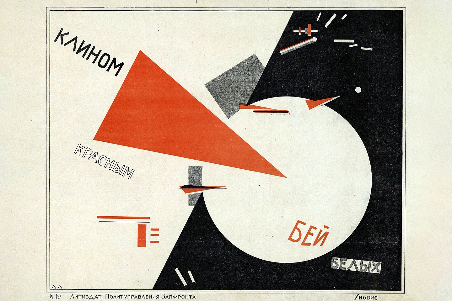
The entire design has a strong diagonal relationship built on a grid layout. It features a limited colour palette, juxtaposition, and sans-serif type. It uses simple, repetitive shapes like circles, triangles, and rectangles to amplify the message in the written text on multiple levels:
- The sharp point of the red wedge encourages Bolsheviks to focus their efforts into one concentrated point against the large but undefined White Army.
- Smaller portions of the Reds are organized, aligned, and sometimes just as pointed, whereas factions of the Whites are in disorder, small, sometimes round, and feel as though they’re running away (see top right).
- The use of simple shapes, colours, and language (a total of four Russian words) allows the message to spread to all proletariats, regardless of literacy or language.
Lissitzky attempts to push Russian society towards his utopia and ideals—for the Reds to win against the bourgeoisie—by motivating the proletariat into joining the focused red point and uplifting them by pointing out the disorganization of the Whites.